dwyl/learn-tachyons

:heart_eyes: Learn how to use Tachyons to craft beautiful, responsive and fast UI with functional CSS!
| repo name | dwyl/learn-tachyons |
| repo link | https://github.com/dwyl/learn-tachyons |
| homepage | https://tachyons-bootstrap.dwyl.com |
| language | HTML |
| size (curr.) | 153 kB |
| stars (curr.) | 582 |
| created | 2016-09-25 |
| license | |
Learn Tachyons 


Learn how to use Tachyons to craft beautiful, 100% responsive, functional and fast User Interface/Experience (UI/UX) with minimal CSS in much less time.
Why?
The User Interface (UI) or User Experience (UX) is the part of your application that the people ("end users") see and interact with. Ensuring that the UI/UX is the best it can be, is easily the top priority for our Web/Mobile projects.
Without good great UI/UX
"nothing else matters"
to the person using your app.
The UI/UX is what matters,
not the programming language,
what type of server,
which “front-end framework”
or “backend infrastructure” you are using;
Nobody cares about the “boring technical details”,
they only care about their own experience using the app/website.

One Minute Summary
Through experience (building many web/mobile apps large and small in teams ranging from 2 - 200 people), we have found that:
- Hand-writing CSS is very time-consuming and repetitive!
- Using (most) CSS “frameworks” results in:
- Lots of Duplication where people re-create styles over-and-over
- “Zombie Code” unused styles that nobody will risk removing
- Bloated apps/sites that take much longer to develop, load and maintain than they need to.
- Functional CSS ensures:
- UI is 100% Predictable, Consistent and free from (unwanted) “Side Effects” (where a change in one place “breaks” something else!)
- It’s immediately clear from reading one block of code what the component does and what it looks like.
- Updates to UI are made in One Place/File. (see diagram below)
- Time to develop your App’s UI scales proportionally instead of increasing exponentially the way it does with most “traditional” CSS frameworks.
- The moment you want anything “custom” most CSS frameworks let you down badly because you have to “override”, Tachyons is made for helping you to use your imagination! The resulting UI will be much less code, load considerably faster and be far easier to maintain!
Tachyons lets you avoid the “CSS Fire":

Extended discussion on the pros/cons of Functional CSS & Tachyons: https://github.com/dwyl/learn-tachyons/issues/1
What?

Tachyons is a CSS Design System anyone can learn/use to craft beautiful, responsive & fast UIs with minimal CSS! Tachyons has all the building blocks you (your team) need(s) to build anything you can imagine.
Tachyons embraces a different style than many popular CSS frameworks known as “Functional CSS”.
What is Different?
When you use the Bootstrap primary button class in your web app,
it looks simple enough on the surface,
you simply add the class to your HTML markup.
Following the example on:
https://getbootstrap.com/docs/4.0/components/buttons/
<button type="button" class="btn btn-primary">Primary</button>

Here’s is the CSS for that bootstrap primary button:
.btn-primary {
  color: #fff;
  background-color: #337ab7;
  border-color: #2e6da4;
}

.btn {
  display: inline-block;
  padding: 6px 12px;
  margin-bottom: 0;
  font-size: 14px;
  font-weight: 400;
  line-height: 1.42857143; /* who needs this level of decimal precision in CSS?! */
  text-align: center;
  white-space: nowrap;
  vertical-align: middle;
  -ms-touch-action: manipulation;
  touch-action: manipulation;
  cursor: pointer;
  -webkit-user-select: none;
  -moz-user-select: none;
  -ms-user-select: none;
  user-select: none;
  background-image: none;
  border: 1px solid transparent;
  border-radius: 4px;
}
Visit: http://getbootstrap.com/css/#buttons
(open your “dev tools”) then inspect one of the buttons
and see for yourself:

What a monolith! There are a lot of CSS attributes there; Bootstrap is quite opinionated about how a button should look and function.
If you want to change/customise any aspect of the button (e.g: font or color), you will need to:
- Create a new class in your
app.cssfile (or whatever your project calls it) - Define the CSS styles for that custom attribute, e.g:
.custom-btn-purple-helvetica {
  font-family: "Helvetica Neue", Helvetica, Arial, sans-serif;
  color: #800080; /* wikipedia.org/wiki/The_Color_Purple */
}
- Add the CSS class to the instance of the button you created.
<button type="button" class="btn btn-primary custom-btn-purple-helvetica">
  Primary</button>
This 3-step process is slow and always ends up with more CSS than if you used pre-existing Tachyons classes. (see below) 🌈
Bootstrap Custom Button (The Old Way!)
What if we wanted a button that looks a little different? We’d most likely need to add another class. e.g:
<button type="button" class="btn btn-dwyl">do what you love</button>
Which requires us to write quite a lot of custom CSS:
.btn-dwyl {
  background-color: #46B6AC;
  border-color: #46B6AC;
  padding: 10px;
  text-transform: uppercase;
  letter-spacing: 4px;
  font-weight: 300;
}

Tachyons Custom Button (New Way!)
Tachyons approaches this with single utility classes
(classes that do one thing).
These single utility classes encourage
a different way of building UI:
all code is in a single place
the html, not the stylesheet:
<button class="bw0 br2 bg-dwyl-teal pa2 white fw1 tc ttu tracked">do what you love</button>
Each class has one responsibility:
bw0- “border width 0” see:br2- “border radius 2” see:bg-dwyl-teal- “background color dwyl teal” (this is an example of a custom color)pa2- “padding all 2”white- “text color white”fw1- “font weight 1”tc- “text align center”ttu- “text transform uppercase”tracked- “with letter spacing”
see: /examples/buttons.html
Note: Tachyons does not have all-the-colors,
hence we had to define our own.
However given that there is a clear format for defining colors
we defined our own as bg-dwyl-teal:
.bg-dwyl-teal {
  background-color: #4DB6AC;
}
This is “OK” because it’s still a single-purpose class that we can re-use for any elements that require the teal background.
What is “Functional” CSS?

You may be thinking:
- How exactly does this make my CSS better?
- Why use this approach when CSS has been written like the bootstrap example for years?
- Isn’t this just like using inline styles? (considered by many to be bad practice in CSS)
- Won’t I end up repeating myself in the HTML?
Let’s have a look at some of the core features
and ideas of Functional CSS and see if we can
answer some of those questions.
Functional CSS is:
Functional :innocent:
Small, clear, easy to read classes that are easy to apply and do one thing. Having small classes means it’s easy to make a set of consistent spacing and type rules - you end up forcing a beautiful type scale & rhythm on your design.
“Good design (my preferred school of good design, at least) is mathsy, rational and pure —and CSS is design— so it follows that there are a bunch of lessons we can bring back from FP land into design.” - Jon Gold Front-End Wizard @ AirBnB
Composable :musical_score: :notes: :musical_keyboard:
In Functional Programming you combine (or compose) a bunch of tiny functions together to do bigger things (like lots of notes to make music!). You end up reusing a lot of your code which is great for performance and consistency! Just like the button example:
<button class="pa2 br2 bg-green tc tracked"> <!--VS--> <button class="btn btn-dwyl">
We’ll end up reusing :recycle: nearly all of those classes, whereas the button classes will only be used for buttons.
Be green! Recycle your classes!

“Doing one thing extremely well promotes reusability and reduces repetition.” - Adam Morse
Immutable :gem: :gem: :gem:
In Functional languages declaring a property
means it will never get overwritten,
something known as Immutability -
i.e it can’t ever be changed (or mutated).
A huge benefit you gain from immutability is
that code is easier to reason about
(you don’t have to go on a hunt to find where
something might have been changed).
CSS on the other hand is inherently mutable
(it’s the “C” in CSS - the Cascade)!
But because fcss (functional CSS) classes are single responsibility,
they aren’t at risk of overriding each other.
This almost eliminates the problems of the cascade
(changing a property somewhere won’t break your code elsewhere).
Another extremely useful property you gain from immutability is something called Referential Transparency. In other words: A thing does exactly what it says on the tin!
We know with a fair amount of confidence what our button will look like just from reading the classes:
<button class="pa2 br2 bg-green tc tracked">
but with .btn & .btn-dwyl classes, for all we know our button could look like:

Yikes! :open_mouth:
And what if we wanted to change it? Do we change our “monolithic” button classes and pray :pray: that they don’t break other buttons elsewhere? :boom: On a BIG project?!
Be realistic, we’re likely to add more and more classes to avoid this from happening. This gets more and more wasteful over time, adding bloat to our CSS files:
In [the monolith] model, you will never stop writing css. Refactoring css is hard and time consuming. Deleting unused css is hard and time consuming. And more often than not - it’s not work people are excited to do. So what happens? People keep writing more and more css - Adam Morse.
Why Tachyons?
What else does Tachyons specifically give us?
Easy to Understand and Use
A great thing about tachyons is how quickly and easily you can get up and running. The classes are easy to understand (once you get used to them), If you know CSS, you know tachyons!
If you find the names too terse you can use the verbose version.
Mobile First Responsive Design
By far one of the most useful features is that almost all classes have “responsive suffix” versions:
for example the “padding all 4” class
pa4 also has 3 other versions:
.pa4-ns { ... }
.pa4-m { ... }
.pa4-l { ... }
ns, m, and l are short
for “not small”, “medium” and “large”.
Tachyons gives you incredible flexibility to change your design at different screen sizes. And by default the “non suffixed“class is the mobile class! This encourages you to design for mobile first and expand outwards. All of this without writing a line of css! Tachyons has the referential transparency of inline styles coupled with the power of media queries!
Accessibility
Tachyons cares about accessibility! Not only does the documentation actively encourage accessibility by providing things like accessible colour combinations, but whenever a release includes functionality that can cause some accessibility issues, it comes with a :warning: warning to ensure everyone is aware of the appropriate usage. :heart:
:warning: For quite some time people have been requesting an additional step in the type scale for 12px / .75rem. While 12px isn’t readable for body copy it does have it’s place in limited usage so I’ve added it to core. :warning:
A Natural Workflow
Using Tachyon’s styles in this way also seems to encourage a more natural workflow when building UIs.
Styles are localized at the HTML template level, rather than being controlled by central CSS files. This fits my workflow because I usually work through a website’s design one page at time… - Jason Li
Jason Li illustrates this perfectly:


Works well with component based UIs
Using a templating engine or framework
(such as Rails, React, Elm, Angular)
means you can reduce the repetition of classes
in your html by reusing them as components.
Great Performance that Scales
As your project grows larger, your stylesheet doesn’t (or only grows very minimally). This has benefits for the user as there’s less CSS to download and the browser has to register less styles overall (it can cache the result of already computed styles).
“Inline styles are 1 to 1 for the browser. i.e an inline style can only style one element at a time. While a class has a 1 to many relationship. This has non-trivial deltas in rendering speed and can greatly reduce jank in a complicated ui.” - Adam Morse
How?
Try Before You Commit (3 Easy Steps)
Getting started with Tachyons is as easy as 1, 2, 3! We’ve created some examples for you to play around with before you decide to use it on your own projects.
If you want to see a quick-reference guide to Tachyons with detailed examples, checkout our Clone of Bootstrap in Tachyons: Tachyons Bootstrap: https://tachyons-bootstrap.dwyl.com
If you want to learn hands-on follow this tutorial
start by cloning and running it on your localhost.
1. Clone this Repository
git clone https://github.com/dwyl/learn-tachyons.git && cd learn-tachyons
2. Open one of the Example .html files in your web browser

See: /examples
3. Edit Some Code!
In your Text Editor / IDE of choice, edit one of the classes:

Optional: Install “Live Server” for “Live Reloading”
If you prefer not to have to manually refresh the page each time, simply run the following command:
npm install && npm start
This will download the dependency on live-server
which will auto-open your default browser:

e.g: http://localhost:8000/examples/buttons.html
In your Own Project
You can get up and running by just adding a link tag in your html
<link rel="stylesheet" href="https://unpkg.com/tachyons@4.8.1/css/tachyons.min.css">
Or grab the latest version
<link rel="stylesheet" href="https://unpkg.com/tachyons/css/tachyons.min.css">
If you want to customize the styles you can clone the tachyons repo locally and install the dependencies
$ git clone https://github.com/tachyons-css/tachyons.git
$ cd tachyons
$ npm install
Make the changes that you’d like to the css files and then run
$ npm run build
This will output both an unminified
and minified css file to the /css directory
Check out this video for a guide to setting up.
Learning the ropes
The Tachyons documentation is fantastic as reference material, incredibly well thought out, readable and easy to search once you know what you want to do.
But if you just want to play around with tachyons and get a feel for the thinking behind it, you’ll find some well-used options below to get you started.
Once you start to get an understanding for how tachyons works, we’ve found the table of styles to be a very useful reference point.
Responsive modifiers
Tachyons includes modifiers which can be added onto the end of any class and will set up your media queries as shown above.
ns covers everything above mobile size, m covers roughly tablets, and l
covers roughly desktop sizes.
Typography
The first place to start when designing is to set a type scale so that you can guarantee a harmonious progression of font sizes (from ‘body copy’ to ‘headlines’) across your application or site - tachyons has this built in!
Tachyons also includes .sans-serif and .serif which each have a set of
appropriate font family fallbacks.
Font size
Aside from standard f1 - f6 sizes (f7 was introduced in tachyons 4.7.0,
but is not recommended for extensive use), f-headline and f-subheadline can
also be used for larger text requirements (usually for print).
Line Height
An agreeable line height promotes readability and tachyons offers 3 options titled according to their most usual uses:
lh-copywith a line height of 1.5lh-titlewith a line height of 1.25lh-solidfixes line height to 1
Font weight and style
Aside from normal andb for bold, fw1 (corresponding to font-weight: 100;)
through to fw9 (corresponding to font-weight: 900;) are available.
i can also be used for an italics font style.
Text alignment
tl aligns text left, tc centers it and tr aligns it to the right.
Layout
Tachyons bases all of its spacing on a specific ratio that provides a much more effortless consistency in spacing across devices, giving you a much higher propensity for things to line up or to at least look harmonious.
Padding and Margins
Padding and margins both follow the same convention to create their 3 letter
classnames (e.g. pa4 or mb2):
- First character:
porm: each classname starts with one of these to denote ‘padding’ or ‘margin’ - Second character:
a(all - adds padding or margin to top, bottom, left and right),h(horizontal - adds padding or margin to left and right),v(vertical - adds padding or margin to top and bottom),t(top - adds padding or margin only to the top),r(right),b(bottom),l(left) - Third character: a number from
0to7
Floating
Float left (fl), float right (fr) and float none (fn) are available and
sets elements to block-level elements.
Because floats are removed from the flow of the page, remember that to force an
element to contain its floated children (i.e. the elements inside it), you’ll
need to apply a clearfix - in tachyons
you give the parent element the class cf.
Display
A simple set of classes that follow a similar naming convention to what should now be very familiar to you, e.g. dib for {display : inline-block} or dn for {display: none}.
There are also a set of display classes for table and table related display properties, which you can find in detail in the documentation with great examples.
Widths
Widths are denoted by the w class, followed by one of 3 types of modifiers:
- Numbers scale which follows tachyons' powers of two scale mentioned above
- Starting at
w1(1rem) tow5(16rem) - e.g.
w1sets the width of the element to the first step in the width scale (1rem) whereasw4sets the width to the fourth step (8rem)
- Starting at
- Percentage literals
- Starting at
w-10for10%and going up in 10s (e.g.w-20,w-30, etc) untilw-100
- Starting at
- Percentages (not supported in Opera mini or IE8 as these are calculations)
w-third,w-two-thirdsandw-auto
Max widths are denoted by mw and support the numbers scale above
(e.g. mw-1 to mw-10) as well as mw-100 (100%) or mw-none.
Heights
Heights are denoted by the h class, followed by one of 3 types of modifiers:
- Numbers scale which follows tachyons' powers of two scale mentioned above
- Starting at
h1(1rem) toh5(16rem) - e.g.
h1sets the height of the element to the first step in the height scale (1rem) whereash4sets the height to the fourth step (8rem)
- Starting at
- Percentage literals
- Starting at
h-25for25%and going up in 25s (e.g.h-50, etc) untilh-100
- Starting at
- Values
autoandinherit
Position
Elements are naturally statically positioned, but tachyons also support .absolute for absolute positioning and .relative for relative positioning.
For positioning of the elements, tachyons provides classes for 2rem, 1rem, 0, -1rem and -2rem, using the following format plus the number (which can all be used with the media breakpoint modifiers at the end):
top-e.g.top-0(for{top: 0}) ortop-2right-e.g.right--1(for{right: -1}, note the additional dash here) orright-1bottom-e.g.bottom--2left-e.g.left-1
Theming
Tachyons comes with a number of pre-defined colours which you can use by themselves to denote font colour or preface with bg- to give an element a background colour (e.g. bg-red).
Hovers
There are quite a few hover states available, the basic being:
dimfades elements or text to 50% opacity on hoverglowbrightens elements or text to 100% opacity on hoverunderline-hoverunderlines elements or text on hovergrowmakes elements scale by 5% of its size on hover
If you’re looking for a specific effect, please read the code at the bottom of the docs as there are more!
Background size
Background size allows an image to either:
- fill its containing element (possibly showing only part of the image if it is bigger than the containing element)
using
cover - be displayed in its entirety (possibly leaving a portion of the containing element blank if this is wider or taller than the image)
using
contain
Borders
Borders follow the same familiar pattern: ba for all 4 borders of the element, bt for the top border, br for the right border and so on.
The interesting part is that tachyons offers:
- Border radius:
- from
br0(no radius) tobr5(1rem) br-pillto obtain a pill-shaped elementbr-100for the 100% border radius to obtain a circular element
- from
- Border widths: from
bw1(the thinnest) tobw5(the thickest) - Border styles (which can be combined with all other border properties):
b--dashedb--dotted
Opacity
Opacity mostly follows a linear pattern o- with a number decrementing in multiples of 10: o-90 (90% opacity), o-80 (80% opacity) and so on.
In addition, tachyons offers: o-05, o-025 and o-0.
How To Create an Image Placeholder
Often in projects that feature images,
we want to display a placeholder when no image is available.
For example in an e-commerce product, we don’t want to have a “blank” <div>
because it’s unfriendly to users.
We can easily solve this issue with a bit of HTML and Tachyons:
<div class="center bg-light-gray ba b--gray tc"
  style="width: 800px; height: 300px;">
  <img class="center pt5"/
  alt="Placeholder Image - Please upload an appropriate one."
  src="https://user-images.githubusercontent.com/194400/49571717-f392d480-f931-11e8-96f2-a8d10cfe375e.png">
  <p class="fw1">This is a placeholder image. <br />
    Please upload a more relevant one. Ideal dimensions:<br />
    <b class="fw5">Width: 800 pixels, Height: 300 pixels.</b>
  </p>
</div>
The effect is:

Complete file for this example in:
image-placeholder.html
Break it down:
Let’s break down this HTML and the Tachyons classes we have used:
- A
<div>which we use to “contain” (or “wrap”) the image and apply the grey background color:center- center the<div>in the page, you can chose your own positioning to suit your needs.bg-light-gray- literally background light gray.ba- border “all” (all sides of the div)b--gray- the color of the border, in this casegray.tc- “text centre”, these abreviations take a bit of learning, but once you know them they make perfect sense.
<img>a tiny placeholder image with an appropriatealttext for accessibility.center- same again, to center the image in the container<div>pt5- “padding top 5”, this is just to add some space.
<p>we use a paragraph to inform/remind the product owner what the ideal dimensions are for the image they should upload.fw1- “font weight 1”, used to “fade” the font on the instructions.fw5- “font weight 5”, make the pixel dimensions more prominent.
To view this in action,
run
npm start
and visit:
http://127.0.0.1:8000/examples/image-placeholder.html
Responsive Navigation Menu
Let’s create a responsive navigation menu with only HTML and CSS!
This is what you can expect in the desktop view:
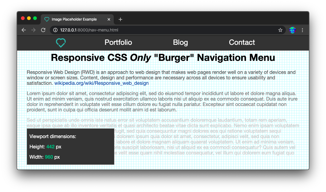
And this is what it looks like in a constrained (mobile) view:

The expanded burger menu:

This CSS-only (no JavaScript required!) responsive navigation menu
relies on Isabel Castillo’s
brilliant hidden checkbox idea:
https://isabelcastillo.com/pure-css-mobile-toggle-menu
(shared by @iteles in
github.com/dwyl/learn-tachyons/issues/10❤️)
The full code for creating a responsive nav is:
<nav class="w-100 fixed top-0 bg-dark-gray">
  <!-- burger menu controlled by invisible checkbox -->
  <input type="checkbox" id="burger" class="dn">
  <label for="burger" class="dn-l fr pr5 f2">
    <i class="fa fa-bars white"></i>
  </label>
  <ul class="menu overflow-hidden db-l w-100-l w-70 list pa0 ma0 mt1-l pt1 f2 f3-l">
    <li class="fl pl5 pl6-l">
      <a href="/nav-menu.html">
        <img src="https://dwyl.com/img/favicon-32x32.png" alt="dwyl logo"/>
      </a>
    </li>
    <li class="di-l pl6 tl pt5-m pb2-m">
      <a href="#" class="white link">Portfolio</a>
    </li>
    <li class="pl5 pl6-m di-l tl pb2-m">
      <a href="#" class="white link">Blog</a>
    </li>
    <li class="pl5 pl6-m di-l tl pb2-m">
      <a href="#contact" id="contact-link" class="white link">Contact</a>
    </li>
    <li class="pl6-m tl dn-l pb3"> <!-- example of mobile-only menu item -->
      <a href="https://youtu.be/dQw4w9WgXcQ"
        class="white link">S'up?</a>
    </li>
  </ul>
</nav>

<!-- custom styles not available in taychons -->
<style>
  .menu {
    min-height: 2.8rem; /* no way to control min height in Tachyons */
    max-height: 0; /* hide menu completely when burger unchecked */
    transition: max-height 0.5s; /* show/hide menu transition */
  }
  /* when checkbox is checked, display menu (sibling element) */
  #burger:checked ~ .menu {
    max-height: 100%;
  }
</style>
Relevant to this quest is understanding the Tachyons display system:
https://tachyons.io/docs/layout/display
Specifically, understanding that
when the suffix -m is appended to a class
it means it only applies to the mobile view.
e.g: pt5-m means “padding top level 5 mobile only”
Likewise when the -l suffix is appended to a given class name,
it means the
e.g: mt1-l means “margin top 1 only large screens”
If you want to see this nav in action,
run npm start
and visit:
http://127.0.0.1:8000/examples/nav-menu.html
Resources
- Tachyons.io
- Tachyons Table of Styles : http://tachyons.io/docs/table-of-styles/
- Tachyons Github Repo : https://github.com/tachyons-css/tachyons/
- Tachyons Verbose Version : https://github.com/tachyons-css/tachyons-display-verbose
- Setting up Custom Tachyons Build
- Tachyons Bootstrap Examples: https://tachyons-bootstrap.dwyl.com/
- Cheat Sheet: https://roperzh.github.io/tachyons-cheatsheet
Articles
- CSS and Scalability
- Functional Programming, CSS, and your Sanity : http://www.jon.gold/2015/07/functional-css/
- Rationalizing Functional CSS : https://marcelosomers.com/writing/rationalizing-functional-css/
- Building and Shipping Functional CSS : https://blog.colepeters.com/building-and-shipping-functional-css/
- Is Tachyons the right CSS framework for me? : http://notebook.hongkonggong.com/2016/04/21/is-tachyons-the-right-css-framework-for-me/
- FCSS : http://eng.wealthfront.com/2013/08/20/functional-css-fcss/
Questions and Discussions
- How is Tachyons different from inline styles? : https://github.com/tachyons-css/tachyons/issues/12
- What’s so bad about inline css? : http://stackoverflow.com/questions/2612483/whats-so-bad-about-in-line-css
Future of Tachyons
Watch Adam Morse (creator of Tachyons) describe the Future of Tachyons: